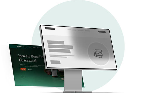
AlgaeCal Homepage
Redesign & UX Research
CASE STUDY
D2C Homepage Redesign
Summary:
Company: AlgaeCal Inc.
Industry: Nutraceuticals / D2C bone-health supplements
My role: Lead Product Designer & UX Researcher
Timeline: April–July 2025
Platforms: Desktop & Mobile
Tools: Figma, UserLytics, Google Drive, Jira
Business outcome: Approximately +25% revenue
What I shipped:
-
A redesigned, component-driven homepage artboard and prototype for development.
-
A research-backed information architecture, including a scalable product carousel, elevated science/clinical proof, and simplified testimonials.


Challenge
The homepage had not been refreshed in over 4 years, yet it remained a primary entry point for both new and returning visitors. The directive was to replatform the design system while retaining the existing content structure.
My challenge:
Modernize the homepage to improve clarity and mobile usability without sacrificing SEO performance.
Success criteria:
-
Raise trust and clarity
-
Maintain or improve purchase-path momentum
-
Deliver a dev-ready, scalable component architecture
Research Plan
I ran an unmoderated remote usability study with U.S. participants matching our primary demographic: women 55+ with bone-loss concerns. Sessions were task-based with think-aloud protocols in a platform called UserLytics. I also used heatmap data collected in LuckyOrange to combine the usability study with real user behaviour data.
Key tasks included:
-
Explore the homepage freely
-
Find product guarantee information
-
Find product categories
-
Change currency
-
Find science/clinical information
Metrics captured: task success, time on task, navigation paths, perceived trust, and product understanding.
Heatmap data results:
By pairing usability testing with LuckyOrange heatmap data, I was able to validate where real users were actually focusing on the homepage. The heatmap confirmed that attention was skewed toward the quiz CTA and navigation links, while critical trust elements like clinical studies and product details were underutilized. This insight directly shaped my design decisions to elevate science content, rebalance CTAs, and reduce cognitive load.

Research Findings → Design Requirements
INSIGHT No.1
Trust & credibility: Users valued clinical evidence and guarantees but struggled to find them.
→ Elevate science and guarantee content visually, with clearer navigation.
INSIGHT No.2
Product comprehension: The flagship product was usually recognized, but other categories caused confusion.
→ Keep the flagship prominent and design a scalable product carousel.
INSIGHT No.3
Mobile experience: Mobile users took longer to complete tasks due to friction and redundant CTAs.
→ Simplify layouts and tighten vertical spacing.
INSIGHT No.4
Secondary navigation: Rare tasks (e.g., currency change) were difficult to locate.
→ De-prioritize for Phase I and plan for Phase II improvements
INSIGHT No.5
Testimonials: Some users trusted them, others were skeptical.
→ Replace dense text with a concise, video-forward carousel and authenticity cues.
Iteration Timeline
Hero & Primary CTAs
-
Explored multiple placements for the Bone Health Quiz.
-
Final decision: I kept the quiz visible but reduced redundancy, placing it near account/sign-in for returning users and under the product carousel, while letting the hero focus on purchase intent.

Clinical Proof & “The Science”
-
Elevated into the hero and mid-page with clear, labeled entry points.
-
Removed hidden drawers that slowed comprehension.
Testimonials → Video Carousel
-
Replaced the dense text wall with a finite, video-first carousel.
-
Added “Real People, Real Results” label and verification cues.

FAQs → Bone Health Consultant (BHC)
-
Removed homepage FAQs to reduce cognitive load.
-
Added an actionable “Bone Health Consultant” block for guidance and an always visible widget for users to contact a representative right away.
Final UX & UI
Information Architecture:
-
Hero: clear promise + clinical proof with one action
-
Product carousel: scalable, reusable card components with flagship prioritized
-
Evidence: clinical studies teaser + guarantee block
-
Social proof: video carousel with authenticity signals
-
Assistance: BHC block for uncertain users
-
Component System: All sections built with the Design System components and packaged for dev handoff.

Product Carousel (Scalable by design)
-
Standardized product cards with consistent CTA hierarchy.
-
The flagship product always led, while supporting products scaled without layout breakage.

Guarantee Block
-
Iterated layouts to balance credibility with mobile clarity.
-
Final: clean composition supporting both imagery and legal copy.


Handoff & Implementation
I delivered a compiled prototype with assets and interaction documentation, clarified testimonial selections and product ordering, and coordinated copy edits, disclaimers, and QA feedback with cross-functional partners.


Results & Impact
The redesign exceeded business goals while improving user clarity and trust. It not only delivered a measurable revenue lift but also reinforced the brand’s clinical credibility and simplified the purchase path across devices. By creating a reusable design system, the project also laid a foundation for future testing, personalization, and product expansion.
-
+25% revenue in the post-launch period (Phase I)
-
Trust remained high; science & guarantees were more discoverable
-
Flagship product correctly identified by the majority of users
-
Testimonials became easier to digest, with stronger authenticity signals
-
Componentized foundation set for future A/B testing and scale

Schedule a walkthrough to learn more about my work.
