

CONCEPT PROJECT
VanOpen Mobile App
Boosting local business through a smart app built for pandemic resilience.
+5
Core Fetures
3 Step
User Journey
Company: City of Vancouver
Industry: Tourism, Local Commerce, and Technology
Location: Vancouver, Canada
Business Model: (B2C) Retail
Timeframe: April 2020
Status: Concept
Role: UX/UI Designer, Product Designer, UX Researcher
Tools: Figma, Miro, Adobe Creative Suite, HTML/CSS Knowledge.
Background
During the height of the COVID-19 pandemic, the City of Vancouver faced widespread business closures and uncertainty among residents and tourists. Many relied on outdated information from search engines, leading to confusion and reduced trust. To address this challenge, I designed VanOpen — a concept app aimed at helping users find open businesses and safe public spaces in real time. The project explored how smart, data-informed UX could support local commerce, rebuild community confidence, and improve urban navigation during crisis conditions.
Problem
During the COVID-19 pandemic, tourists visiting Vancouver struggled to find accurate information about which businesses were open. Online platforms like Google Maps couldn’t keep up with constant changes, leading to confusion and wasted time.


Solution
VanOpen is a concept app I developed during my online training at the California Institute of the Arts. Designed to support Vancouver’s tourism industry during and after the COVID-19 pandemic, the app helps visitors navigate the city safely by providing real-time, verified information aligned with local recommendations and restrictions.
Goals
-
Help the City of Vancouver to recover from the COVID-19 pandemic
-
Guide tourists based on Provincial and Federal restrictions
-
Increase traffic to local or small businesses.
Research
When Canada entered major lockdowns, I realized how frustrating it was to find accurate, up-to-date information about local businesses, public parks, and health mandates — including hours of operation, capacity limits, or temporary closures. To better understand this problem, I conducted extensive online research and interviewed a few neighbours and visitors living in Vancouver. Everyone shared the same frustration and asked the same simple question:
“What’s open?”
Tourists want to enjoy their time while in the city but the data in Google Maps or Apple Maps is inaccurate or slowly updated. Google search engine is also a compilation of both updated and outdated information, so looking for something simple as mask requirements can be tricky.
Insight Analysis →
Translated insights into clear design directions that guided the app’s flow, content, and overall user experience.
01
Visitors can’t find accurate information about outdoor or indoor places.
→ Both local and international tourists struggle to access reliable details about the locations they want to visit, as much of the data is unavailable or inaccurate due to the unpredictability of the pandemic.
02
Visitors don’t have time to do extensive research.
→ Most tourists have limited time and are often exhausted from traveling and navigating COVID-19 protocols. While official provincial websites provide the most accurate information, they are time-consuming to browse and written in overly technical language.
03
Locals are also confused.
→ The provincial government responds quickly to outbreaks or rises in COVID-19 cases, often changing restrictions from one week to the next. This makes it difficult even for locals to provide accurate advice to visitors.
04
No ultimate platform for reliable information.
→ Almost everyone I interviewed said the best way to find official information was through Google Search and Google Maps. However, they also agreed that the data is rarely updated by either Google or local businesses.
Criteria Filter
To ensure users find relevant and accurate information quickly, the app filters data based on visitor needs and interests. Users can select criteria such as business hours, COVID-19 restrictions, fees, and accessibility requirements. These filters adapt to each group — foreign or domestic tourists — and display personalized results about landmarks, scenic views, activities, art, culture, and food. This structure allows VanOpen to deliver context-aware recommendations that align with users’ goals and current conditions.

Target Audience
Local tourists are Canadians or permanent residents from other provinces who prefer not to travel abroad. While they may have visited Vancouver before, they’re seeking fresh adventures and opportunities to enjoy the natural beauty of British Columbia. Foreign tourists come from a wide range of countries and often speak languages other than English. They typically stay for less than two weeks, are not overly concerned about COVID-19, but still wish to follow safety protocols.

PERSONA No 1
Foreign Tourist:
Maria Hernandez is visiting Vancouver from Costa Rica. Her native language is Spanish, but she speaks basic English. She is 30 years old and traveling with her boyfriend for one week to explore Canada’s west coast.
Objectives:
-
Visit iconic landmarks and scenic spots.
-
Learn about Canadian folklore and culture at local museums.
-
Enjoy the city’s vibrant art and outdoor attractions.
Frustrations:
-
Language barriers make research and reservations difficult.
-
Unaware of specific indoor health mandates.
-
Business hours and capacity limits on Google Maps are often inaccurate.

PERSONA No 2
Domestic Tourist:
Thomas Langlois is a domestic traveler visiting from Montreal. He chose to explore within Canada to avoid international travel complications. He is 25 years old, and English is his second language.
Objectives:
-
Go on outdoor adventures and make the most of his vacation.
-
Experience local cuisine and culture.
-
Discover safe places to visit under current restrictions.
Frustrations:
-
Outdoor activities often have capacity limits due to COVID-19.
-
Unsure if a provincial vaccine card is required for restaurants.
-
Unsure which events are active or cancelled.
Current user journey
Taking the personas as a reference, I analyzed how they think and behave when planning for a visit to Vancouver. Below is a user journey focused on domestic visitors.

User Flow
Inspired by the two personas, I analyzed how they behave and react when searching for places to visit. The following chart focuses on the process travelers follow when looking for popular destinations in Vancouver.

Wireframes
For visualization purposes, the wireframes are divided into three segments. The first segment includes the splash screen, which introduces the user to the app. Next, users are prompted to create an account to save their preferences — this can be done using Google, Apple, or Facebook, or by entering the information manually. Afterward, the app collects basic details about the user’s vulnerability status (a consent form may also be required) by asking a few key questions. Finally, to refine the suggestion algorithm, users are asked about their personal interests.


Secondly, the app informs users about current COVID-19 restrictions and recommends places to visit based on their interests, accessible through simple interactive icons. With this information, users can decide where to go, and once they arrive, they receive a notification confirming they’ve earned credits for visiting. Finally, these credits can be redeemed for digital coupons displayed as swipeable cards — a fun, incentive-based feature designed to encourage engagement and support local businesses.


Design System
A design system was developed primarily for email purposes, but I recognized it was essential since no unified design system previously existed for Comex Paints.
Color Palette:
Inspired by the two personas, I analyzed how they behave and react when searching for places to visit. The following chart focuses on the process travelers follow when looking for popular destinations in Vancouver.

Font style:
Proxima Nova family font has been selected for the project due to its readability, legibility, and accessibility. The app is meant for visitors whose priority is to get information as fast as possible. This family font makes it easier for the user to navigate the app with the right hierarchy.

Iconography:
The icons are designed to be both easily recognizable and visually appealing. They follow a consistent grid, stroke weight, and proportion system to maintain uniformity across the app. The main purpose of the icons in the VanOpen app is to make navigation faster and help users access the right information with a single tap.

Spacing:
Whitespace has been carefully considered both horizontally and vertically between components and throughout the overall layout. All spacing increments follow an 8-pixel grid across the app to maintain visual consistency. The spacing system is also flexible and responsive, as not all components behave the same way.

Buttons and UI components:
Branded colors were applied to the button designs to maintain visual consistency throughout the app. Each component also follows established spacing rules and structural layouts that have been analyzed and tested for functionality and future scalability of the system.


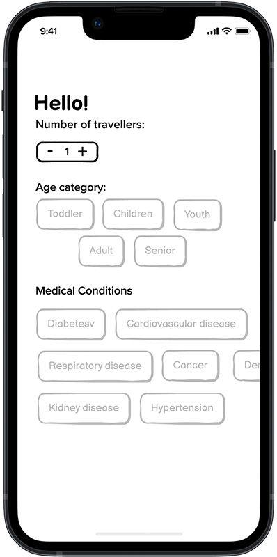
Smart COVID-19 Screen
The most important data used to filter information for users is their level of vulnerability to COVID-19. This is determined by factors such as age range, group size, and any medical conditions that may put a member’s life at risk. These criteria were defined based on research conducted by the UK government. The smart filter is intuitive, allowing users to swipe right to explore more options. It provides key information quickly in an interactive and engaging way.
Intuitive Questionnaire
Another key factor in the app’s functionality is understanding the user’s interests and intentions. This information helps suggest suitable destinations based on current restrictions and the health vulnerabilities of the user and their travel companions.

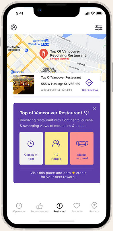
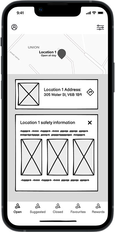
Smart Recommendations
After users enter their preferences and COVID-19 vulnerability data, the app suggests and provides helpful information—such as operating hours, capacity, and mask requirements—allowing users to make informed decisions without wasting time.
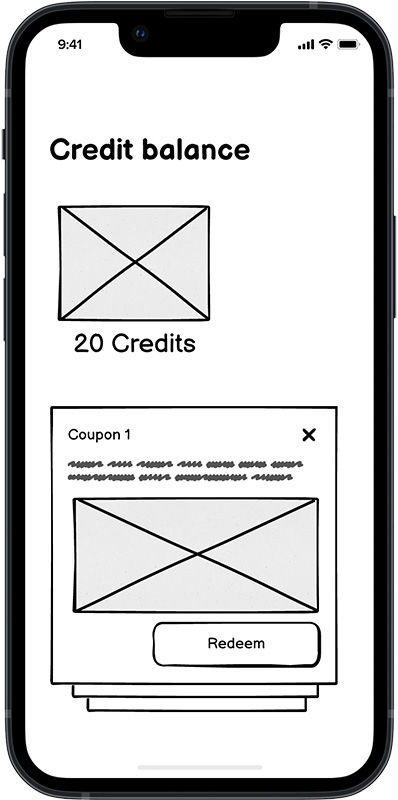
Reward System
What sets VanOpen apart from Google Maps is its rewards program. The goal is to drive traffic to participating businesses and specific neighborhoods. The program is simple: users earn credits by visiting locations and can exchange those credits for discounts, coupons, and more. These incentives aim to help revitalize Vancouver’s economy, which has been impacted by COVID-19 and its recurring variants.

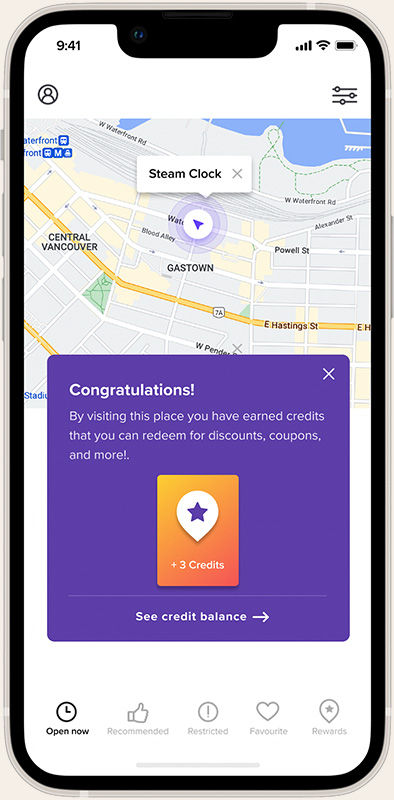
Location-Based Rewards
Users can earn credits by visiting places such as parks, landmarks, and other attractions. This system uses GPS to track visits and reward participation. While some may worry about users faking their locations, this is not a major concern since the main goal is to encourage exploration and boost city traffic. This feature makes discovering Vancouver more rewarding and enjoyable.