

CASE STUDY
Comex UX Newsletters
Transforming top print ads into UX-driven campaigns.
+23%
New Members
+16%
Convertions
Company: Comex Paints
Industry: Construction & Home Improvement
Location: El Salvador
Business Model: (B2C) Retail
Timeframe: 2013, 2017 – 2018
Role: UX Strategist, UI Designer, Data Analyst
Tools: Adobe XD, Adobe Creative Suite, A/B Testing data, and HTML.
Background
Comex Paints, one of Latin America’s leading home improvement brands, needed to adapt its successful print campaigns into engaging digital experiences. While the company’s newspaper ads consistently performed well, they lacked a cohesive online strategy to reach mobile users. Working under Riot/TBWA in El Salvador, I was responsible for transforming these print layouts into responsive, data-informed email newsletters that preserved the brand’s visual strength while optimizing for usability, accessibility, and conversion.
Problem
Transforming Comex’s traditional campaigns into digital experiences required balancing creativity with precision. The goal was to modernize the format without losing the brand’s visual integrity or marketing impact.
-
Maintain adversiting message and adhere to strict brand guidelines.
-
Translate static print materials into responsive, accessible digital formats.
-
Ensure consistency across devices while improving engagement through data-driven A/B testing.

Research & UX Strategy
My main responsibility was to identify the best-performing newspaper ads and transform them into engaging, data-driven newsletter emails for Comex subscribers. To achieve this, I collaborated closely with the marketing team to gather insights and performance data, analyzed visual hierarchy and messaging, and reimagined layouts optimized for mobile users.
Each design decision was grounded in marketing analytics, UX research, and A/B testing to ensure every email met accessibility standards, strengthened brand consistency, and improved engagement.


Color Palette
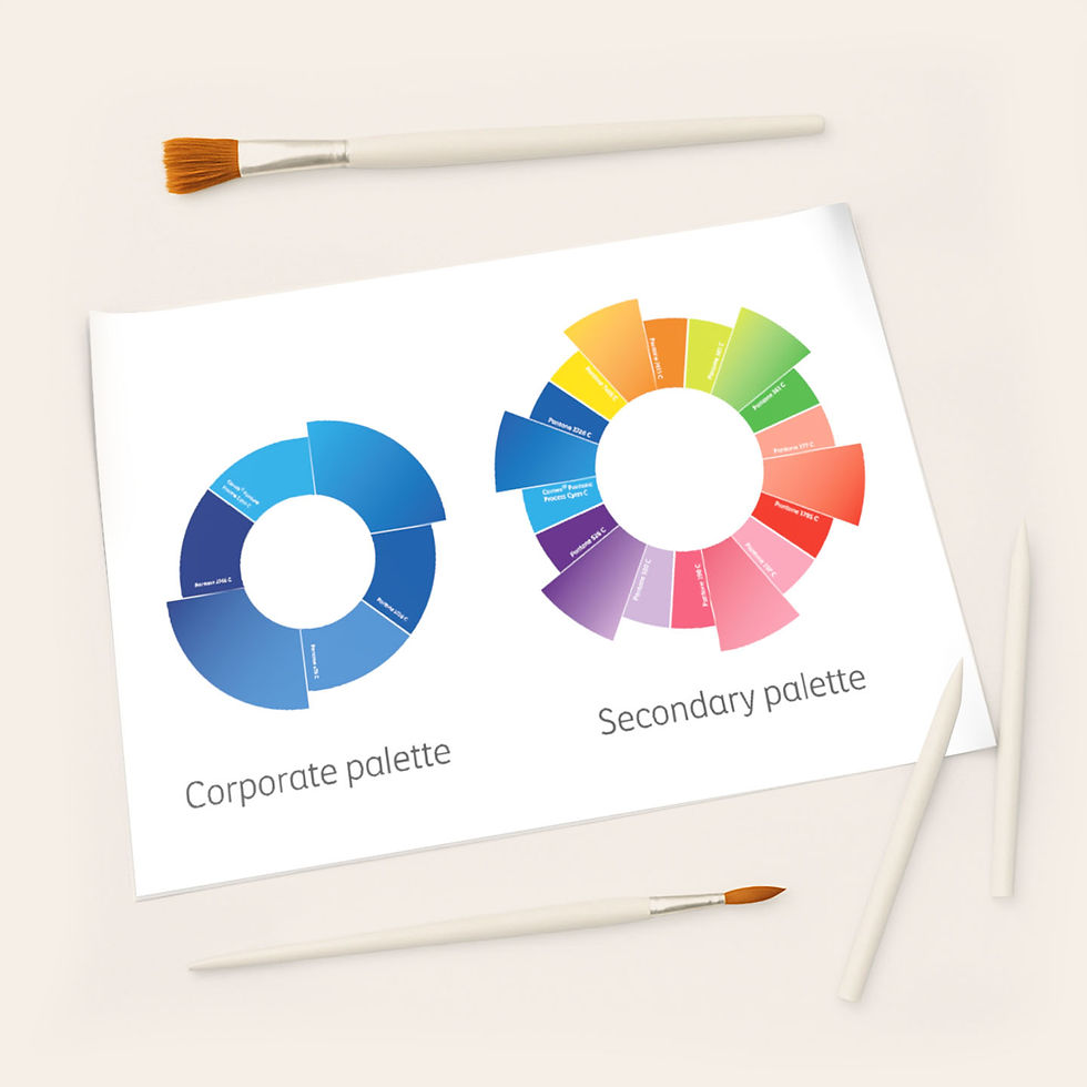
Comex Paints is known for its rich, energetic color identity and strict adherence to brand consistency. For the newsletters, I worked with both the corporate and advertising palettes, refining tones to ensure ADA compliance and optimal digital contrast. Each adjustment maintained the warmth and vibrancy that define Comex’s brand while enhancing legibility across devices.
This careful balance between accessibility and expressiveness allowed the emails to preserve the visual energy of Comex’s print campaigns while meeting modern UX and accessibility standards.
Typography
Comex Paints developed its own proprietary typeface, but for the email templates, I selected only a few styles based on readability, accessibility, and visual hierarchy. The goal was to ensure clear content scanning and smooth information flow across screens.
I tested different weights, sizes, and line heights to identify the most legible combinations for mobile and desktop layouts, improving navigation and overall user experience while staying consistent with the brand’s visual system.

Spacing and CTA
The horizontal layout was specifically designed to improve legibility and ensure flexibility across different screen sizes. I defined a set of spacing rules to maintain consistent distances between elements, adapting them based on content density and design requirements.
The CTA buttons were intentionally kept short—two to three words—with a height of 46 px, slightly above the minimum recommendation. The design follows Comex’s brand style, and the rounded shape was chosen for its friendlier, more approachable visual appeal compared to sharp edges.

Iconography
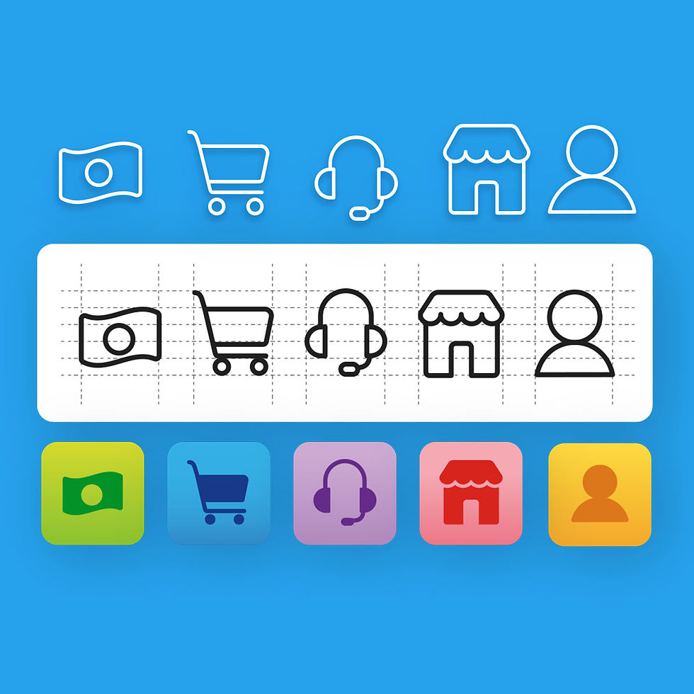
A dedicated grid system was designed to align and scale all icons used across the newsletter templates, ensuring visual consistency and balance. Each icon was crafted with simplicity and clarity in mind, allowing it to function effectively as either an outline or a solid shape depending on context and hierarchy.
The icon style reinforces Comex’s approachable visual identity while maintaining pixel-perfect alignment and legibility across devices. Each icon supports scannability and quick information recognition—proving that, indeed, each one is worth a thousand words.


Components
The email template was built around two core modules designed to maintain structural consistency regardless of content or campaign type. Each component reinforces visual hierarchy, readability, and brand recognition through a unified UX framework.
Built in Adobe Creative Suite, the modules are fully responsive and easily editable, enabling the marketing team to update offers and visuals without compromising layout integrity or user experience. This modular design system ensures scalability and efficiency across all future communications.
Template Structure
After conducting analysis, prototyping, and usability testing in collaboration with developers and marketing teams, I delivered a scalable email design system that supported consistent performance and remained in use for several years.
