CASE STUDY
AlgaeCal Design System
Building a design system from scratch.
+25%
Revenue Growth
4x
Faster Process
Summary
Company: AlgaeCal Inc.
Industry: Health, Wellness & Nutrition
Business Model: (D2C) e-commerce
Timeframe: July 2025 – August 2025
Location: USA & Canada
Role: Product Designer, UX/UI Designer & UX Researcher.
Team: Shareholders, marketing, and web development.
Tools: Adobe Creative Suite, Figma, Storybook, Builder AI, HTML/CSS, and Chromatic.
Background:
When a digital product grows without a design system, the cracks become visible quickly: inconsistent experiences, slow delivery, and teams working from scattered sources of truth. That was the situation I stepped into, a website that had scaled organically, built page-by-page without a shared design foundation.
UX and development were operating in silos disconnected from formal documentation and styling. Every new page meant starting from scratch. I led the initiative to build a design system from the ground up one that unified our visual language, accelerated delivery, and became the single source of truth across teams.
Key Metrics Snapshot:
-
+25% revenue growth from redesigned experience
-
4× faster page creation (7+ weeks → 15 days)
-
100% brand consistency across all touchpoints
-
Cross-team adoption by design, engineering, and marketing
Problems:
-
Slow development: New pages took over 61 days to design and launch.
-
Brand inconsistency: Typography, iconography, and card styles varied across the site.
-
No source of truth: Styling and content lived in scattered Excel sheets and documents, leading to errors and rework.
Goal: Unification

Research & Methodology
We adopted Brad Frost’s Atomic Design methodology (atoms → molecules → organisms → templates → pages) as the foundation. This approach gave us a shared mental model for breaking down complex interfaces into reusable parts, which helped both designers and developers think systematically about scalability.
-
Audit: We analyzed existing pages and mapped out inconsistencies in typography, icons, and component.
-
Benchmarking: We looked at industry design systems (e.g., Apple UI Kit) to identify best practices.
-
Stakeholder input: We hosted sessions to educate teams on the value of modular design systems.
Research & Methodology
We adopted Brad Frost’s Atomic Design methodology (atoms → molecules → organisms → templates → pages) as the foundation. This approach gave us a shared mental model for breaking down complex interfaces into reusable parts, which helped both designers and developers think systematically about scalability.
-
Audit: We analyzed existing pages and mapped out inconsistencies in typography, icons, and components.
-
Benchmarking: We looked at industry design systems (e.g., Apple UI Kit) to identify best practices.
-
Stakeholder input: We hosted sessions to educate teams on the value of modular design systems.


DESIGN PROCESS
From Insight to Implementation
Insights Analysis
I conducted an unmoderated and qualitative user study and analyzed heat map data to identify patterns.

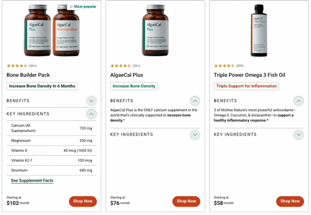
"I can’t quickly tell which product is best for me. The bottles look very similar. What is the difference? The ingredients and pricing aren’t easy to compare."
Userlytics Study
— 5 of 7 participants
Users wanted to see key ingredients without extra clicks
Users want to compare prices
Difficulty distinguishing flagship products


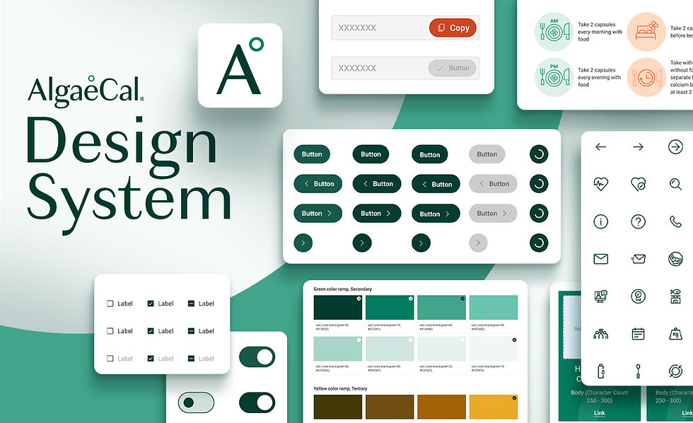
AlgaeCal Design System
To bring the system to life, we created components in a structured order — starting from atoms and building up through molecules, organisms, templates, and finally full pages. This progression ensured scalability, reusability, and a consistent foundation across the product.
1. Foundations (Atoms):
Typography (Granville, Roboto), colors, spacing, and iconography.


Variables:
294+ breakpoint variables in Figma were built to control responsive behavior across all components. Each variable defines how elements like cards, dialogs, and subscription modules adapt across mobile, tablet, and desktop, including width constraints, padding values, and visibility toggles. Boolean variables like mobile header: True/False control element visibility per breakpoint without requiring separate component variants, reducing file complexity.
Spacing values reference primitive tokens (e.g., space/gap/400), so updating the spacing scale propagates changes globally. This system eliminated manual resizing, ensured pixel-perfect design-dev handoff, and allowed us to switch between breakpoints instantly while maintaining consistency across 235 components.
Font structure:
Granville and Roboto create a strong responsive system that blends brand character with clarity. Granville gives headlines a distinctive, trustworthy presence, while Roboto delivers clean readability across all screen sizes. Their compatible proportions keep the interface consistent from mobile to desktop, supporting a clear hierarchy and an accessible, user friendly experience.


Iconography Structure
I created a refined style guide to address inconsistent usage across the site. Icons were standardized using the IBM UI Guidelines with a consistent grid, stroke weight, and spacing rules, focusing on improving readability across devices.
In collaboration with another UX designer, we integrated these icons directly into the design system as a font so they could scale with other foundations.

Visual Rules & Guidelines
To ensure consistency, I developed a guideline that defines the AlgaeCal icon style. The document acts as a single source of truth for all teams. It standardizes:
• Stroke weight
• Spacing rules
• Grid alignment
• Proportions and scale
• Fill and outline styles

Icon personality or style
All icons use a 2-pixel stroke and 2-pixel rounded corners, inspired by the circular shape of the AlgaeCal symbol. This keeps every curve aligned with the brand book.
The grid helps maintain precision, and round caps create a smooth, unified look. The examples also show what to avoid so the icon system stays consistent with the AlgaeCal brand.


I designed an icon library of more than 80+ custom icons with consistent strokes and pixel perfect alignment for clear use at any size. The set works across mobile and desktop and stays fully aligned to the AlgaeCal design system.
Each icon uses a structured naming convention like Ac-Icon-Mobile-Menu to make handoff and development fast and predictable.


2. Molecules (Elements):
Buttons, inputs, selection controls — styled with CSS box model + flexbox principles.
3. Organisms:
Product cards, lead gen forms, banners, supplement Facts table (centralized and reusable).


4. Templates:
Blog posts, product listing pages, product description pages.

Motion & Visual System Style
Beyond UI components, I created 3D animated visuals to support marketing and product storytelling.
-
Purpose: Communicate the product's 16 essential nutrients in an engaging, digestible format
-
Premium aesthetic: 3D visuals elevate the brand with a professional look competitors cannot replicate
-
Scroll-based & responsive: Animations trigger as users navigate, creating an interactive experience.
-
Performance optimized: Exported as Lottie JSON files under 1MB, ensuring fast load times without sacrificing visual quality
Testing & Iteration
I worked closely with development to align on component structure, naming conventions, accessibility standards, and token integration. Marketing performance data and internal A/B tests helped validate which patterns worked and guided refinements to layouts, components, and content hierarchy.

Outcomes & Impact
Business Impact:
The new design system powered AlgaeCal’s redesigned website, generating 25%+ more revenue shortly after launch. Page creation also became much faster, allowing the team to respond quickly to marketing and product needs.
Efficiency Gains:
Reusable, pre-built components reduced development time and eliminated repetitive one-off builds. Page creation cycles dropped from over five weeks to just a fraction of that time.
Consistency:
Typography, colors, and components were standardized across the site. Outdated icons and mismatched card treatments were replaced, creating a unified brand experience.


Collaboration:
A shared vocabulary using tokens and BEM conventions improved communication between designers and developers. Cross-team alignment extended to UX, dev, marketing, and eCommerce.
Scalability:
Centralized data sources made the system easier to maintain. The Supplement Facts table, for example, was rebuilt as a single reusable component, reducing errors and simplifying updates.
My Role & Contributions
Led UX and design initiatives—from system creation to page redesigns—focused on consistency, usability, and compliance.
01
Construction & Implementation
Built a fully functional design system in Figma, including tokens, components, states, documentation, and iconography. Contributed reusable patterns for forms, cards, CTA groups, and product modules, ensuring consistency and quality across the system.
04
Iconography Design
Redesigned and standardized a comprehensive icon set for the design system—building a coherent family with consistent grid, stroke weights, hit areas, and accessibility contrast—and documented detailed usage guidelines to ensure clarity and scalability.
Reflection & Learnings
We faced challenges in shifting stakeholders away from a “page-by-page” mindset, investing significant time upfront in building tokens and components before seeing ROI, and managing existing tech debt while rolling out new standards. Along the way, we learned that early education — through video sessions — was critical for adoption, and that the Atomic Design framework provided a clear mental model for both designers and developers.
We also realized governance was essential: maintaining the system through Figma, Storybook, and Shopify integrations ensured consistency over time. Moving forward, we plan to expand documentation and onboarding resources, automate QA with Chromatic to speed up regression testing, and continue evolving components based on usability feedback.