

CASE STUDY
AlgaeCal System User Research
Evaluating a redesigned design-system carousel for sales pages.
13
Participants
FOUR
Critical Insights
Summary
Company: AlgaeCal Inc.
Industry: Health, Wellness & Nutrition
Business Model: (D2C) e-commerce
Timeframe: July 2025 – August 2025
Location: USA
Methodology: Unmoderated Study
Role: UX Researcher
Design: Federica Bonatti
Tools: UserLytics, Google Gemini, Google Apps
Background:
As part of the ongoing development of the design system, critical components were carefully evaluated through user studies to ensure they support clarity, ease of use, and business goals. The redesigned sales-page carousel is a key component in the purchase journey, shaping how users browse products, understand pricing, and make selections that lead to conversion.
Because this component directly impacts engagement and revenue on sales pages, a dedicated usability study was conducted and led by me to assess its intuitiveness, identify friction points, and determine whether the new design effectively improves the user experience.

Research Plan
The research plan follows standard UX structure, outlining the problem, goals, research questions, participant criteria, tasks, and success metrics used to evaluate the carousel.
01
Type of Test:
I used User Acceptance Test (UAT) to validate that the redesigned carousel delivers the experience it was created for and is ready for use on high-impact sales pages.
02
Research Goals:
1. How intuitive is the carousel for users?
2. What adjustments, if any, would improve the new component?
03
Research Questions
1. Are users able to select the intended product and price?
2. At what point, if any, do users experience frustration during their journey?
3. What aspects or information, if any, might be missing?
04
Key performance indicators:
User error rate: This quantitative measure evaluates how often users make mistakes while trying to finish tasks and interact with the component.
System Usability Scale (SUS): This is a qualitative indicator. It will consist of a questionnaire that asks participants their opinions and sentiments about the component design.
05
Methodology:
-
Platform: UserLytics, Unmoderated usability study
-
Device: Mobile
-
Location: United States (remote)
-
Participants: 13
-
Profile: Women aged 55 to 65+ who have obtained at least some college education, are employed, and have family status. No need for bone loss knowledge, but good to have.
-
Study length: 30 mins maximum.
DESIGN PROCESS
Usability Testing Script
Screener Questionnaire:
I created questions to confirm that participants matched the study’s profile.
How often do you buy products online?
• Once a month (Advance)
• Once every 3 months (Advance)
• Once every 6 months (Advance)
• Once every 12 months (Advance)
• Not at all (Reject)
How comfortable are you navigating websites or online stores on your smartphone?
• Very comfortable (Advance)
• I rarely use my phone for online shopping (Reject)
• Not very comfortable (Advance)
• Somewhat comfortable (Advance)
Which device do you primarily use for online shopping?
• Mobile (Advance)
• Desktop (Reject)
• Tablet (Advance)
• Laptop (Reject)
Have you ever researched bone health or taken supplements related to bone density?
• Yes (Advance)
• No (Advance)


USERLYTICS DATA
Study Final Results
Task 1
Initial Impressions
On a scale of 1–5, rate your initial impression of the page. Please explain your response out loud.
Note: To protect proprietary information, all metrics shown are rounded or approximated and do not reflect exact data.
AI Analysis Integration
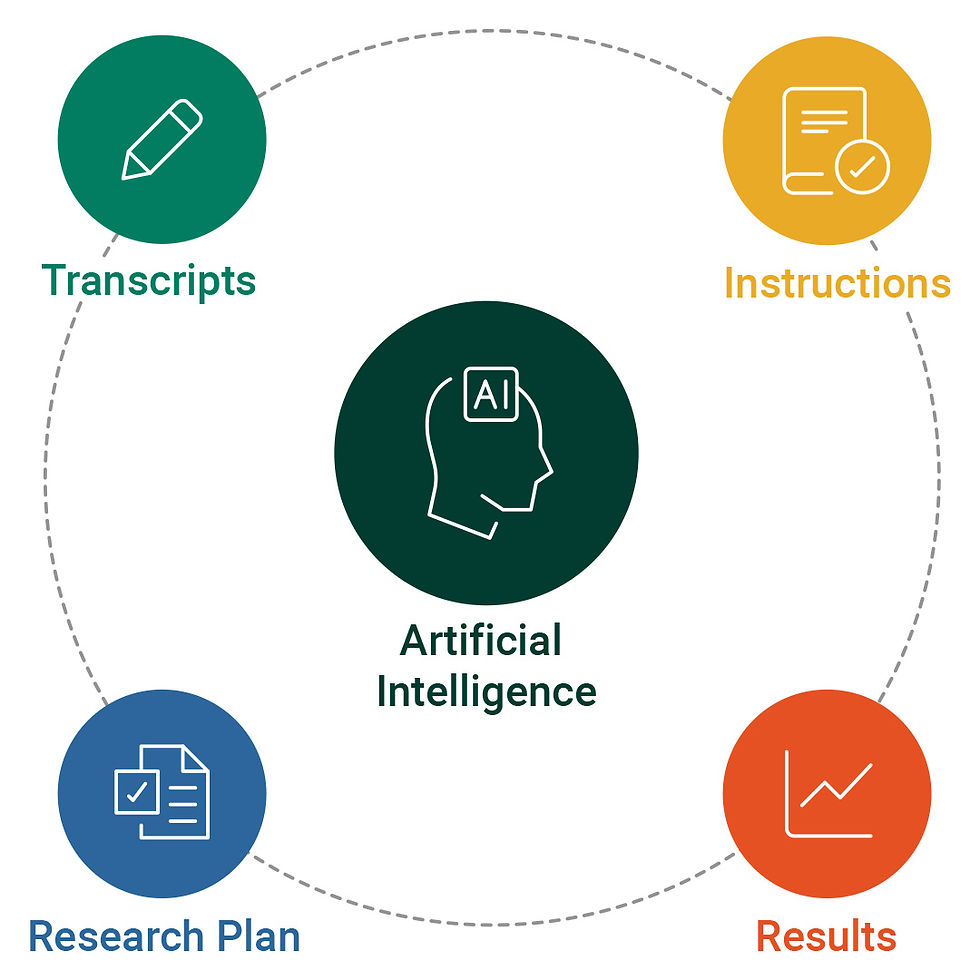
AI is not yet reliable enough to accurately interpret human behavior or independently generate insights. However, it is a powerful tool for UX researchers to identify patterns, extract quotes, and support data validation at scale. I developed a custom process that involved creating a structured project with specific instructions, transcripts, and usability frameworks. Due to privacy considerations, the company chose to use Gemini as the platform for this work.
.jpg)
.jpg)
INSIGHT No. 1
Interrupted User Flow
The user flow is not working as intended because users are redirected to the cart immediately after making a selection, limiting their ability to learn the product details such as ingredients. As a result, users often make decisions without fully understanding what the product includes, relying instead on prior knowledge, assumptions, or visual cues. This premature transition interrupts evaluation and reduces confidence, particularly for users unfamiliar with the products.
Supporting User Quotes
-
“I’m not really sure where I would have found a description of the product.”
-
“I feel like I kind of didn’t click through and learn about the products and just picked based on what I knew.”
-
“If I knew nothing about the products, I would want to learn a little bit more about what they’re good for.”
-
“I picked collagen because I already take collagen and know what it does.”

Recommendations:
To improve access to product information, the following actions are suggested:
01
Add Hyperlink
Add a “Learn more” link or CTA within the carousel to give users who are unfamiliar with the products easy access to additional information.
02
Add a pop-up
Use a lightbox or modal to surface supplement facts and key product details without removing users from the selection flow.
03
Reconsider User Flow
Reconsider removing the product description page from the user flow, as it plays an important role in helping users build understanding and confidence before purchase.
INSIGHT No. 2
The Carousel Successfully Highlights the Flagship Product
Participants consistently identified the Bone Builder Pack quickly and treated it as the primary or default option. The carousel’s visual hierarchy, labeling, and placement guided users toward this product early in the browsing experience, aligning user behavior with the company’s business goal of promoting the flagship offering. This indicates that the carousel’s information architecture and emphasis effectively communicate product priority.
Supporting User Quotes
-
“The Bone Builder Pack looks like the main one, so I’d probably start there.”
-
“This seems like the most complete option, so I’d go with the Bone Builder Pack.”
-
“If I’m trying to improve bone density, this feels like the one they’re really recommending.”
-
“That one stands out as the primary product.”
Supporting Data
-
11 of 13 participants selected the Bone Builder Pack when asked to choose a product that interested them.
-
10 of 13 participants selected the Bone Builder Pack again when asked to choose the top-rated product.
-
The Bone Builder Pack was frequently referenced before users explored other products, suggesting early recognition rather than comparison-driven discovery.

Recommendations:
The order of products in the carousel significantly influences user attention and selection behavior
01
Position marketing strategy
The carousel can be used as a business lever, not just navigation Because users follow hierarchy cues so closely, the carousel can be used strategically to:
-
Promote priority products
-
Support campaigns
-
Shift focus based on inventory
02
Support secondary products
The current design pushes the right product, but it also encourages default behavior over informed choice.
Improve by adding subtle cues for alternatives (e.g., “Best for first-time users,” “Good add-on”)
INSIGHT No. 3
Horizontal Scrolling Creates Friction
Several participants struggled with the horizontal scrolling behavior of the carousel, reporting difficulty navigating between products and plans. This interaction pattern was not immediately discoverable for all users, leading to confusion, missed options, and reliance on the first visible product rather than deliberate comparison.
Supporting User Quotes
-
““Scrolling left and right is kind of brutal.””
-
“I’m not sure how I would see the other products.”
-
“I can’t really get around in the prototype. It’s hard to get around.”
-
“I couldn’t flick between the products very easily.”

Recommendations:
Participants consistently reported frustration with the horizontal scroll, suggesting opportunities for improvement.
01
Bring back navigation controls
Provide arrows, buttons, or a secondary navigation pattern (e.g., tabs or dropdowns) for users who struggle with swipe-based navigation.
02
Use snap points thoughtfully
Ensure cards snap cleanly into place so users feel in control, not stuck between items.
03
Ensure performance is smooth
Lag or delayed responses amplify frustration with horizontal scrolling more than with vertical scroll.
INSIGHT No. 4
Strong Information Architecture
Participants consistently identified the flagship product and the most economical pricing option, with the majority selecting the Bone Builder Pack and the 6-month supply across multiple tasks. All participants completed every task successfully, even as several reported friction with horizontal scrolling in the carousel.
Supporting Data
-
11 of 13 participants selected the Bone Builder Pack when asked to choose a product that interested them.
-
10 of 13 participants selected the Bone Builder Pack again during the “top-rated product” task.
-
11 of 13 participants selected a 6-month supply when asked to find the most economic deal.
-
All of the above were the right selections
Recommendations:
Participants consistently reported frustration with the horizontal scroll, suggesting opportunities for improvement.
01
Personalize hierarchy
Architecture works globally, but different users have different goals.
-
Reorder or highlight products based on entry point or campaign
-
Adjust emphasis for first-time vs returning users
02
Interaction design
Improve horizontal scrolling behavior so navigation matches user expectations and reduces friction.
03
Collagen Shows Strong Interest
Users who selected Collagen did so intentionally, not because they missed the Bone Builder Pack. This suggests Collagen can be promoted without cannibalizing the flagship offering if positioned correctly.
Outcomes & Impact
Design System Validation:
Most participants were able to complete key tasks, indicating that typography, text hierarchy, and color contrast are readable and accessible on mobile and can be reused confidently across the design system.
Valuable marketing insights:
Insights collected are not only valuable for design decisions but also inform marketing strategy, such as the consistent user interest in collagen.
Design guidance:
Findings translate user behavior into actionable design directions, giving designers evidence to support layout, interaction, and labeling decisions.
